
Puzzling out the Numbers: A response

A few weeks ago, Shadi Eskaf if the University of North Carolina’s Environmental Finance Center posted a series of two blogs on his household water use. The first simply showed the data from his bi-monthly water bill, graphed out across the years, and prompted readers to use the water data to make inferences about his family’s water use. People really gave it some thought – it’s one of the few times I’ve seen constructive dialogue in response to a blog post!
A bit later, he posted an updated version with an annotated graph and narrative explanation of what was actually going on, including a spike as they prepared to move and went into a washing frenzy. His post made me wonder what we’d see if I dug into my family’s water data. I, however, am not going to leave you hanging, mostly because I don’t know whether any of you would actually respond! So here is our data, and a bit of un-examined commentary. Your thoughts and responses are encouraged!
First, we have roughly fourteen years of quarterly water data. Before we even get into the use patterns, let me use this as an opportunity to rant about the bill itself. Our bills come quarterly. Shadi’s comes bi-monthly, and many utilities send theirs monthly, which allows for much more rapid feedback to problems. Communities that have begun using automated technology to alert customers to aberrant high use are way ahead of my community of Wauwatosa, Wisconsin, where a problem could run on for a very long time before being detected in an unexpectedly high bill.
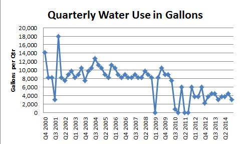
And then of course one should make note of the frustratingly obfuscating units “CCF”. You undoubtedly know that CCF stands for 100 cubic feet, and that multiplying by 748 gal/CCF easily converts it to gallons. But really, couldn’t they just reprogram the bills? 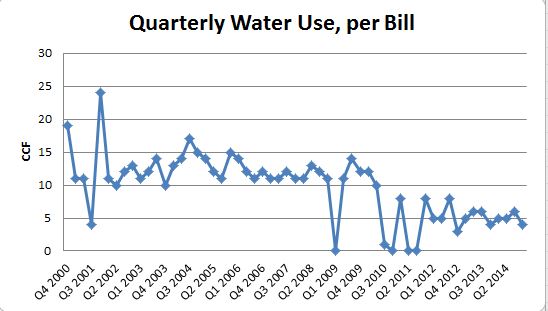
The second graph shows the exact same data, simply converted to gallons, the unit that is still most comfortable for most Americans. What probably jumps out here are the highs, lows, and re-calibration after about 2012. These are all explainable with a little family history.
My family of four moved to Wisconsin in the summer of 2000, leaving us time for one water bill that year. The following summer we had some delicate, native woodland landscaping installed which needed a lot of babying. Hence, the spike in water use about a year after moving in. Haven’t had an excuse to use the sprinkler since.
You’ll also notice the dips down to zero, or near-zero water use at three different times. The first one is simply sloppy filing – I lost that receipt. The next one, in 2010, reflects a water main break. I was sitting in a corner of Logan Airport, trying to get some work done before flying home from a meeting, when my then 16-year old son called me to say that we had a geyser in our front yard. In short order he had wrangled the city into turning our water off, and hooking us up by hose to our neighbor’s water. Replacing the ruptured lateral set us back a few thousand dollars, but at least the city gave us and our neighbor free water for a billing cycle.
A few quarters later we had the opportunity to repay the favor to our neighbor. I don’t recall exactly why they couldn’t use their water, but it had something to do with lightning. In any case, the city hooked them up to our system and we both got a free ride for a bit. (Aside: Do other cities let go of their revenue that easily?)

One of the things that surprised me about this data is that we apparently use a bit more during the summer than the winter. I don’t remember watering plants with potable water since those delicate plantings in 2001, (we have two rain barrels, and are not averse to collecting grey water when needed), but perhaps we do more washing in the summer? We sweat more? My husband makes more beer? Who knows?!
But I digress. The final graph breaks the use down from quarterly consumption to daily consumption. The top graph is total household consumption – it’s just the same numbers in the previous graph divided by 90 days/quarter (close enough). But because the number of people in our home has fluctuated through the years, I wanted to see how it would shake out when kid fluctuations were factored in. One son went off to college in 2007, but his place was taken by an exchange student. Eleven months later when she left we were down to three people, but the following year another exchange student topped us back off at four. Then we went down to three, and now it’s been just two of us for the better part of the last three years.
Another story for another day would be to drill into that purple line, the per person daily residential use. California’s Gov. Brown just declared that Californians need to cut their use by 25%, which I’m sure leads to lots of cocktail conversation about how low can you go. My family has been hovering around 25 gal/person-day or even lower (many quarters are below 20) for a long time, including many years of raising teenagers. Last time I looked, we’re not suffering. How low do you think is a reasonable expectation?


Thanks for writinng
LikeLike